R0man
New Member

Posts: 17
|
Post by R0man on Oct 9, 2010 16:29:06 GMT -8
So this is my work over a few years with long breaks between and such so yeah. I will put them in order from old at top to newest at bottom to the best of my memory. Any critic is welcome and even just nice comments =] Okay so this image here is the first and last of my unicorn attemps, it is also one that I did when I first got JASC Paintshop Pro 8 so I played with a bunch of things on the program lol  Ah... another old and sad attempt. 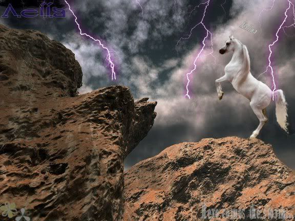 Playing around again... 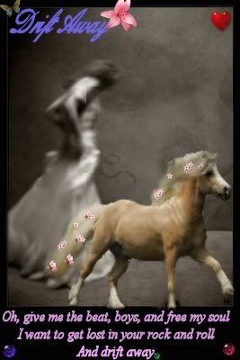 ... 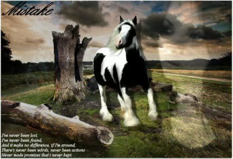 This one was made about a year ago  This one was made shortly after the one above  This is one I was rather proud of when I first made it and I still love it now lol 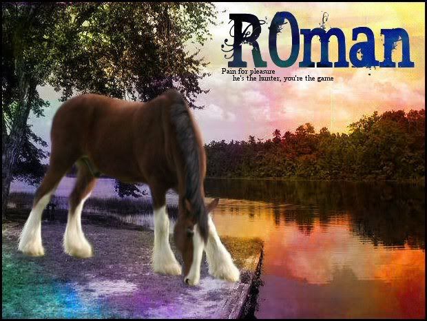 A nice attempt I thinks =] 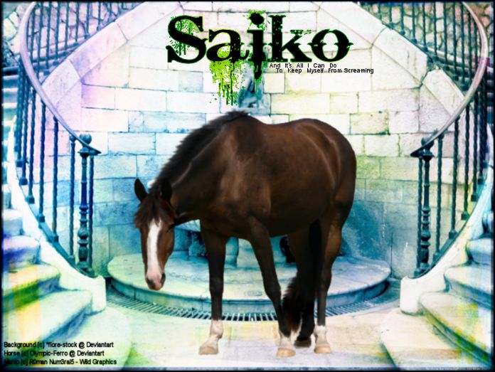 This one here I tried some new things on 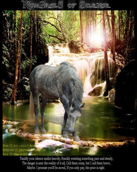 I quiet like this one but just then after not looking at it for some time I noticed the horse looks a bit grainy =P Just a warning that my manips get quiet ugly after this one >_<  Made for my graphics studio I once had on Wild Equines 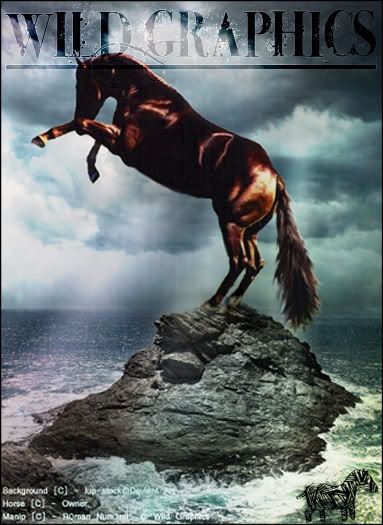 Made for a site I once owned... 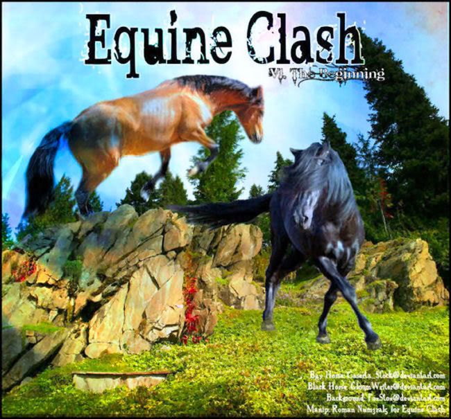 This one was made about three or four months ago...  This is one that I made two weeks ago... after not making manips for a while they become something horrible like this >_<  |
|
kangatoo
Moderator    The modinator
Posts: 67
|
Post by kangatoo on Oct 9, 2010 17:24:15 GMT -8
I really like the concepts behind all of these which is good. You can't make a good photo-manipulation without a good concept C:
I think the two things I notice consistently with your art is that you seem to cut out the manes and tails as best you can but you don't smudge them so they end up looking pretty choppy. Along with that it looks like you blur the horses instead of smudging them and that creates a completely different effect. It's possible that your just not smudging them and they're already blurry, in that case I suggest you do one of two things. Either look for pictures in which the horses are in better focus or blur the background to match the horse.
You show a lot of potential, I like the 5th and 9th ones quite a bit ^^
|
|
|
|
Post by `Poet. on Oct 9, 2010 18:10:18 GMT -8
Wow! You've improved immensely over the past few years! I really like #9 and the very last one. I did notice the same thing as Kanga, though. Most of the horses are quite blurry - if you want to get the "soft" effect, I'd suggest smudging. It gets rid of all the pixels and grains, but it doesn't make the outline of the horse nearly as blurry  One other thing is color balance. If a horse is in a really green forest, it'll have some green tones playing off of the coat. Same goes with an ocean scene - more blues and stuff. (Your manipulation called "Anne" looks good, color balance-wise  ) You can do this by painting over the horse with, for example, green, and then play around with the opacity, blending modes, etc. Or if your program has something called "Hue/Saturation" or "Color Balance", definitely play with those. But other than that, they look very nice! I really like the variety of fonts you've used. Great job! ;D |
|
R0man
New Member

Posts: 17
|
Post by R0man on Oct 10, 2010 14:57:20 GMT -8
Thank you Kanga and Poet =D
Before I start a manip I always need a concept behind it or it tends to fall apart or just appear rubbish, I have better ideas of what I want out of an image when there is some sort of concept =]
I do use smudge a fair bit in my manips though sometimes I don't smudge the horses at all unless the outline of it looks a bit rough and I think that's where I go wrong =[ Also with the really blurry ones I think I was testing out the Gaussian blur cause it was a tip I was given when looking to improve my manips and it kind of failed lol.
With the manes and tails I do smudge them unless I like the look the them then I do leave it sometimes. With the Renshu one I did not touch the mane but I did draw in the forelock for the first time which I was quiet proud of lol and with the Juliets Love Story I tried to draw in the whole mane and tail... it may surprise you but that is a size one brush  With the last one I tried drawing it in and I tried smudging it but neither worked >_< I really need help with the mane and tail drawing in and or smudging. With the last one I tried drawing it in and I tried smudging it but neither worked >_< I really need help with the mane and tail drawing in and or smudging.
With the colour balance I can see what you mean, Renshu is probably the best example lol I used two different textures there where I think I should have just used one or none >_<
Yeah my program does have "Hue/Saturation" and "Color Balance", I will defiantly have a go at using them.
Thanks, I do like using a range of different fonts depending on what concepts I have for them =]
JASC Paint Shop Pro is the same as GIMP really so whatever GIMP has so does JPSP. I have had JPSP 9 for about a year or two as there is a free download of it on the net.
Thank you both again and I will take in your advice and see how my next manip comes out and then I will post it here so you can tell me if I have improved or not =]
|
|